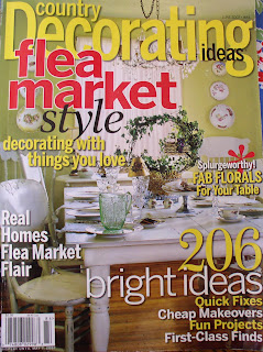

I totally missed this issue, however I was lucky enough to read my friend Sherri's copy and oh my goodness! The June 2007 issue of Country Decorating Ideas Flea Market style was brimming with page after page of wonderful decorating ideas.
As I have mentioned in previous posts, I am looking for a new couch and chairs for the family room. Of course, my hub is happy with what we already have and just doesn't understand why I want to replace them. Back when we bought them they fit right in to the Tuscan-English decor that I was aiming for. But, with time and life changes, I am gravitating towards a casual English Cottage look with a little bit of kitsch.
I love this room, even though it is a little too busy for me, but the colors and the accessories are right up my alley. I am especially fond of the red toile fabrics and the green painted furniture! This is totally the look that I am leaning towards.
So in the meantime, I am stashing my pennies away and taking my time finding the right piece. This little sofa in the pictures looks like you could just sink down into it and relax with a good book and a cup of tea....but first move some of the pillows so they don't get smooshed!

I love that magazine...full of inspiration!
ReplyDeleteHi! Thanks soooo much for visiting me, Esther Sunday. I truly appreciate it! Love your blog, I see we must be twins separate at birth as we have tons in common! I will be happy to add you to my links and promise to check in! And, the magazine - man do I love them! I look at them over and over again. Wonderful idea and sooo much that can be done with thrifted finds! Love, Esther Sunday
ReplyDeleteI love your blog! This was my first time here and I couldn't believe how much you reminded me of 'me'. I'm trying to clear out my tuscan themed kitchen and family room and get back to a shabby english cottage style. I'm gravitating towards roses.....again. And I too am very fond of red toile. I have it in my bedroom. Great blog and i will definitely visit often.
ReplyDeleteHey that looks like a magazine I would've liked to have had! Thanks for sharing that lovely photo!
ReplyDeleteInspiring!
Melissa
Wow! I am soaking in tons of ideas from this picture!
ReplyDeleteOh, I missed that issue, too. I love the room you show. While not as casual, those colors are what I use in my living areas. Except my walls are green and I use red and yellow for accents.
ReplyDeleteI bought this magazine issue when it came out and just loved it! So many great ideas in it. I can't wait on the next issue!
ReplyDeleteBarbara